Jim dine

Jim dime, and American pop artist, also apart of the Neo-Dada movement which is audio, visual and manifestation which means clearly showing or embodies something abstract of theoretical. This is relatable as dine was born in 1935 neo-dada movement was created during 1950-1960. 

Researching Jim Dine I realized the differences in his two styles of work due to the tonal work, colour and media. 

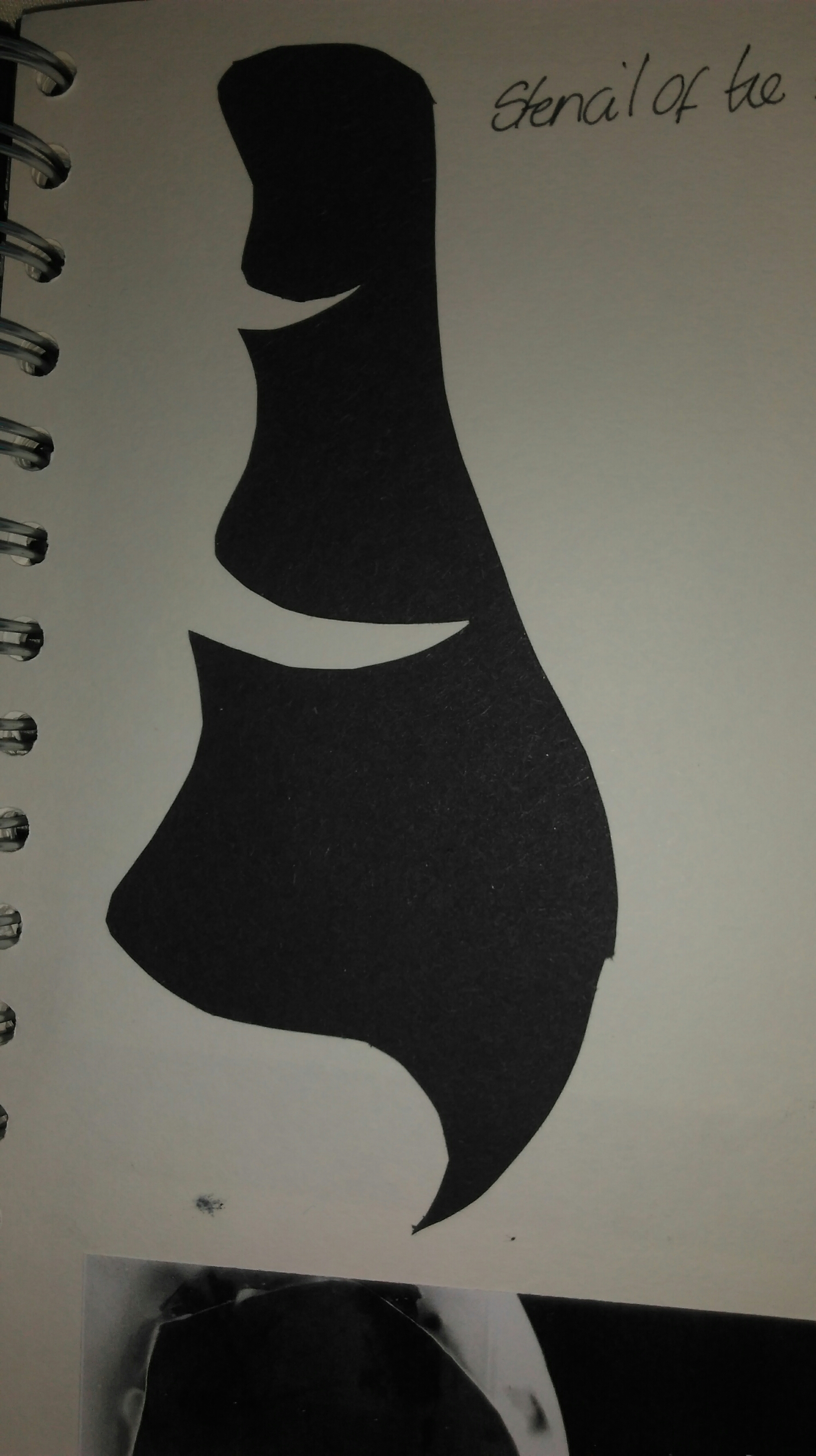
Looking at Dines work he still uses the bold thick style with his materials. Dines most popular pieces of work is from the ‘Tool Box’ collection. 

Looking through the tool box collection I began to identify the techniques dine has used with the dark bold materials, such as lithograph. Looking through his work I realized her shaded the negative space to create a strong shaped of an object.

With identifying the fine detail of shade in this object it gives off a 3D effect, as the tool is standing off the page due to the structure of th shade, the angles its placed. 

As dine work in a bold way with his dark tonal shades, this also effect is influenced in his colour work. Even though dine uses vibrant colours I’m different medias, such as inks, chalks, oil pastels ect he always shows the bold style in what ever techniques he uses. Doing so he makes the imagery eye catching, stands out of the page.

noticing these effects is why I appreciate the work of dine. 

Memory 

In this task I was asked to create a map of how to get to my class through the college doors. 

Doing this I thought of an abstract style using continues line in fine line pen. Looking at the image I started to develop color using water paints, i like how it gives a watery light wash look towwards the ink. doing so I chose colors that represent different emotions as so many people come in and out of the building feeling a variety of ways, such as angry, relaxed, sad, happy.

Wire and modrock 

Before experimenting with the wire I began to design different structures inspired by a ram’s horn. Manipulating the horn I sketched a variety of structures and 3D forms using my imagination of walking round the structure. I began thinking about the designs I could use to transform into the modrock. 

Using chicken wire I began experimenting, starting to think about how the structure will form, due to the weight and mass of the 3D elements. Manipulating the wire in the shape I decided to create I cane across solving a problem which was figuring out how much wire I’d need to use to produce a reasonable size. 

After creating the structure I needed to keep the tight strong shape so I used the string to hold it together.

During the process of the modrock I resolved the problem of the layering thickness and smoothness, as the modrock is rather rough and dry. Resolving the problem I soaked the modrock in water then used the technique of stroking the straps around the modrock to create the smooth texture. 

*picture of modrock*

After creating my sculpture I began researching string sculpture artisy like Barbra Hepworth. 

Due to the research I began designing attachments to my sculpture 

After picking a design I began problem solving where the point on the sculpture I will drill to create the same design I chose. 

Creating the holes in the modrock went well but the most difficult problem I solved was using the string to pull through the dense modrock. As this was a struggle I used a piece of wire as a long needle, tying the string around the wire made it easier to thread through as the original needle was to small. Even though I used the technique of the wire and thread I found it fidgety trying to get the thread through the whole without getting caught on the chicken wire inside the modrock. 

After doing these techniques the outcome was successful. I thought I’d do an alternative technique of threading the string over and under to create a plat. I also think this worked well due to the colour tones of the blues as they have a strong contrast with each other and the bright white modrock 

I believe during the process of designing my 3D string form I came across a lot of problem solving and struggles with how to solve technical situations such as attaching the string, making sure its tight and neat. Creating my structure with the chicken wire and how to use the utensils accurately. Overall I think I did well during the process and produced a fine detail of a 3D sculpture. 

3D paper collage 

3D elements is something I struggle finding the criteria of. As the task set was creating a 3D collage using the sculpture I produces was difficult to face as my 2D sculpture design is very distorted. Finding the weight of a side the sculpture could balance on was hard as it has a variety of surfaces, structures and angles. 

Due to this problem I solved  using the idea of a cube, interpreting the photograms samples I designs on to them constructing more of an interesting collage. Sticking the cubes on the A3 cartridge paper

Also experimenting I use wire to create the same shape. 


Stop motion 

Stop motion is popular for animation in the art industry. A cinematographic technique where the camera is repeatedly stopped and started to give animated figures and impressions of movement. 

Stop motion is most common in films such as Wallace and Grommit produced by Nick Park. Nick created Wallace and Grommit with claymotion which is one of the many forms of producing a stop motions, this works by creating characters and objects to make a stop motion film. 

Their are different types or stop motion, another type is 3D animation which is profound on a computer using editing skills making things like adverts and short films. 

Collagraph 

Using printing paper, overlapping with different materials such as paints, diluted PVA, different types of paper I bagan to create textures that reflect on the ink.  Working on texture, composition, tonal work, forms, shapes

Avoied a thickness in college 

Creating a shape for the collagraph I manipulated my drawings of the ram horn by printing and manipulating the image by cutting and replacing shapes to create different structures. 

After creating the shape with paper I began to draw what my eye was most attracted to, this created a different image I began to shade the negative space. This images I will use for my collagraph plate. 

Obscure balance and a variety of weights. Negative space to show hollow areas. Distorted form of cubisme structure with mixed mass of surfaces 


When I began to create my collagraph design I wasn’t confident experimenting with a wide range of media as I didn’t know how it would come out but after getting into the comfort of experimenting I began starting with stenciling parts of the shape and overlapping the image to give it a thicker surface for the ink to start creating more of a contrast. 

also using masking tape, PVA glue and some form on hatched stick plastic as it has an unusual texture and as I believe would create a great contrast, eccoing the smooth furface of the masking tape and glue. 
Looking for more materials to use I came across some silver sticky paper I began to cut into fine pieces to manipulate the line, making it bolder, protubating due to my problem of making the structure more of a natural 3D form.started r 

  • After producing textures on the surface I started to think about the background. As I don’t want a smooth surface for the ink to pick up I use acrylic paint and a pallet knife which constructed a sharp, busy surface. 

Photogram Processes

A photogram is a photographic image that is created without a camera. Using different materials such as glass, plastic, etc, On the surface of the paper creates the outline of the negative and positive shadows, as the paper is photo-sensitive to light, The paper is exposed to light when the objects are placed on the surface, it illustrates how the light is blocked in areas of the photogram to create the positive and negative shadows, The shadows from the photograms creates the 2D and 3D effect outcome that show what the objects were and the reflection of shade and contrast.

During the task of the photograms I used a variety of objects such as, fork, keys, feather, jar. these objects created different lines and tones as they have different thicknesses and sizes to devop on the photogram. 

For example my first photograms I was just experimenting with different objects with a variety of sizes, thickness and translucents. 

This problem I solved I began by using different translucents, thickness (ect) you can see how the light has hit the objects creating different contrast on tonal shades and line.

As this photogram is bolder, creating the 2D illusion on the paper with thick line. 

For the next problem solving I began creating structures of 2D and creating 3D form by manipulating 2D materials I tested on the photograms to create 3D illusions from the ideas I created. 

This idea I created was inspired by my mixed sculpture piece I did, which was another problem I solved by manipulating my observational drawings from the museum.

This photogram is what was produced after creating the stencil, as it created the bold lines I also used the cut out from the stencil as it created a beautiful reflection on what the inside of the stencil shape creates. 


The bottom picture is an experiment I did on acetate, creating a 3D form from cardboard. After creating the 3D form I decided to manipulate it to a 2D form I used on the photogram.

Processes 

After creating my pattern design, I began to look at the placement of where they’ll be set as a repeated pattern has to have an accurate structure to be correct as a design. 

After creating the structure I began to background of my pattern design to make the piece stand out. As the design is already busy I decided to colour the back in a dark pink, blending the colors red, white and black which contrasted beautifully as I used the sponge technique to create a detailed texture instead of having a plain, bland surface. I use the this colour as it clashes well with the theme of the pattern. 

Beginning to edit my pattern design I started to work on the tonal colour and shade of how I was to produce the pattern. Trying to fit a strong pattern in a certain structure. Overall my design is successful with the editing.

Lip stick

Going back to the task of creating pattern I thought the foundation bottles looked rather plan on their own as of the skintone colour and how they’re positioned. Due to this I began to plan and come up with the idea of using another object to put into my Patten task. As I use foundation bottles for imagery I came up with the idea of lipstick to set a them. 

Drawing my lipstick I made the colour tone as bright and bold as possible to make the Patten page stand out more. 

Using water colours I mixed pink and red to create a dark pink tone of lipstick to go with the bright yellow-gold outside as they clashed to create a bold yet bright lipstick. Outlining the image with a black fine liner gives the image more of an unrealistic, cartoon effect which I thought was a good idea as the foundation bottle originally came from an observational painting that is rather realistic. Doing so this gave a mixture of style I can use and interpret into my work. 

Beauty products 

Enjoying the task of using unique materials I did a mix of nail varnish and eyeliner for this sample. 

I started of with background of colour to create a contrast with the thin line of white liner on top of the ‘down town red’ colour nail varnish. This makes the white stand out due to the red. 

As I didn’t the same with the other but using silver I began to draw an eyeliner with an eyeliner to make an obvious appearance what materials I’ve used. 

To experiment more I swapped the colour code over to see the different contrast in colour I’d get to develop the idea and expand my sample testing. Doing so I believe all samples came out well.